Managing Device Visibility
Sometimes when building a page you'd like your page to behave differently on mobile than it does on desktop. You can use Mobile Visibility controls that let you do just this.
Using mobile visibility controls to improve mobile performance
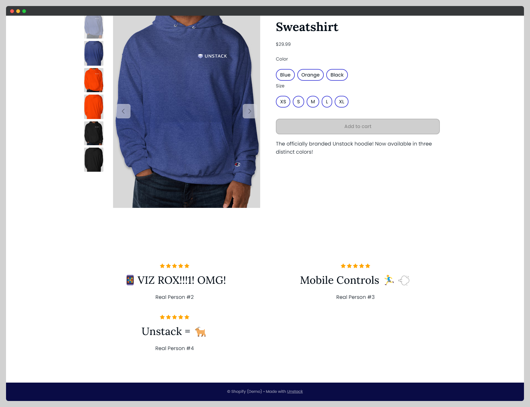
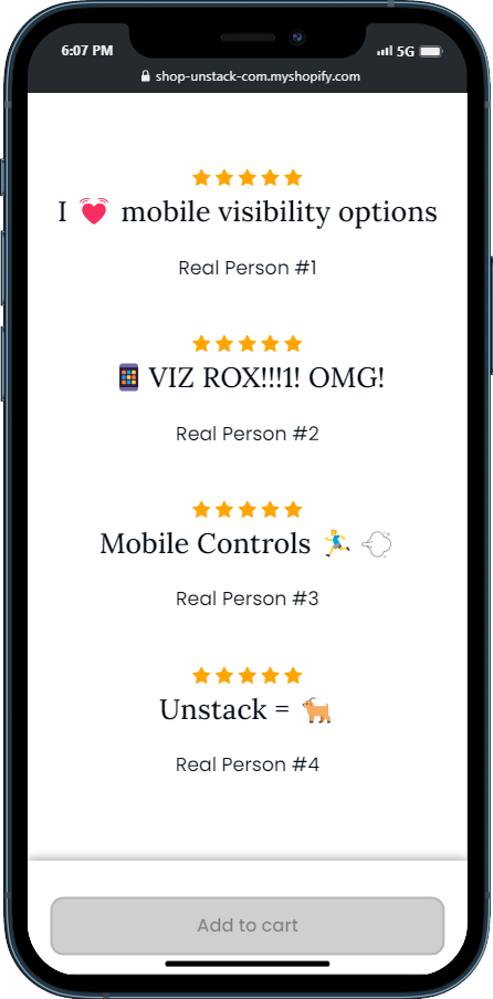
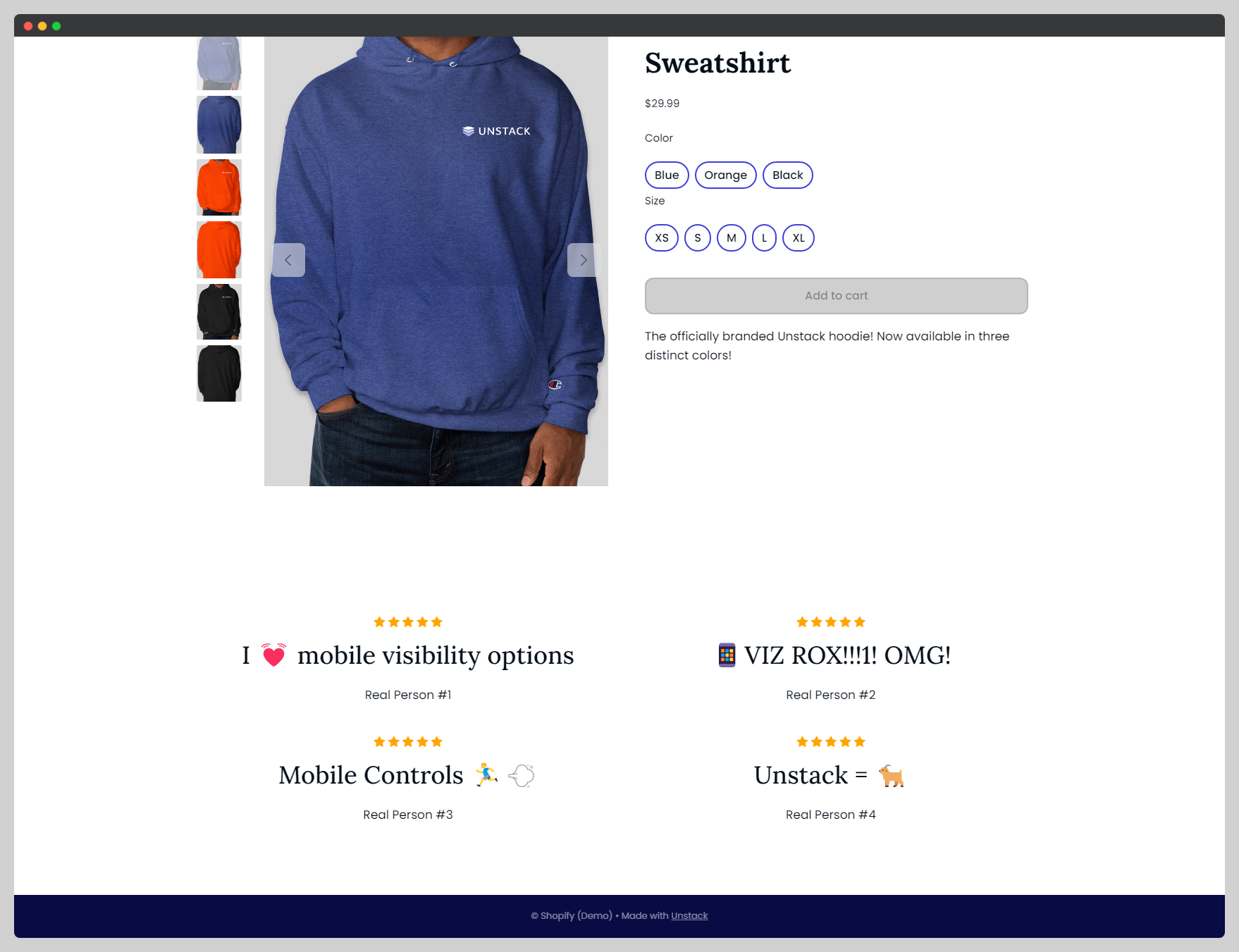
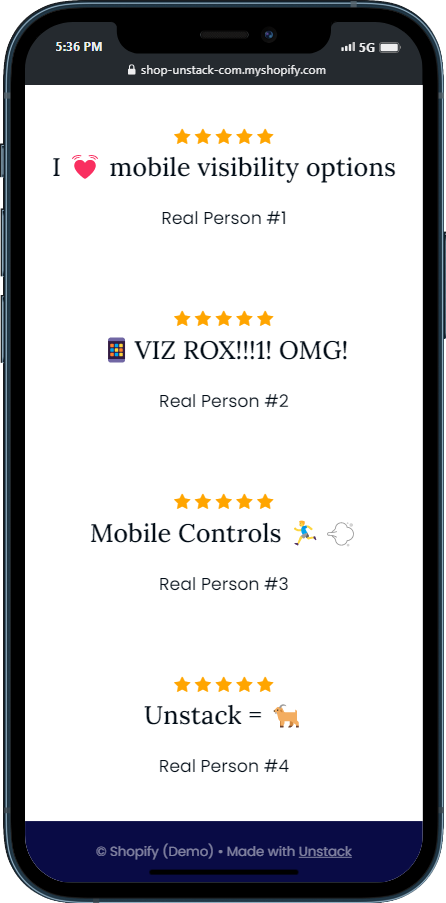
Take a look at the below screenshots; you'll see I have a reviews component which is taking up a lot of the viewport on mobile but looks fine on desktop. Using the new mobile visibility options I can now hide certain elements (boxes or entire sections) by toggling on a new toolbar option.
This option can be found on the toolbar of any section or box in our editor and can have one of three values:
-
All Devices: Shows the target on all devices.
-
Mobile Only: Only show the target on mobile.
-
Desktop Only: Only show the target on desktop.
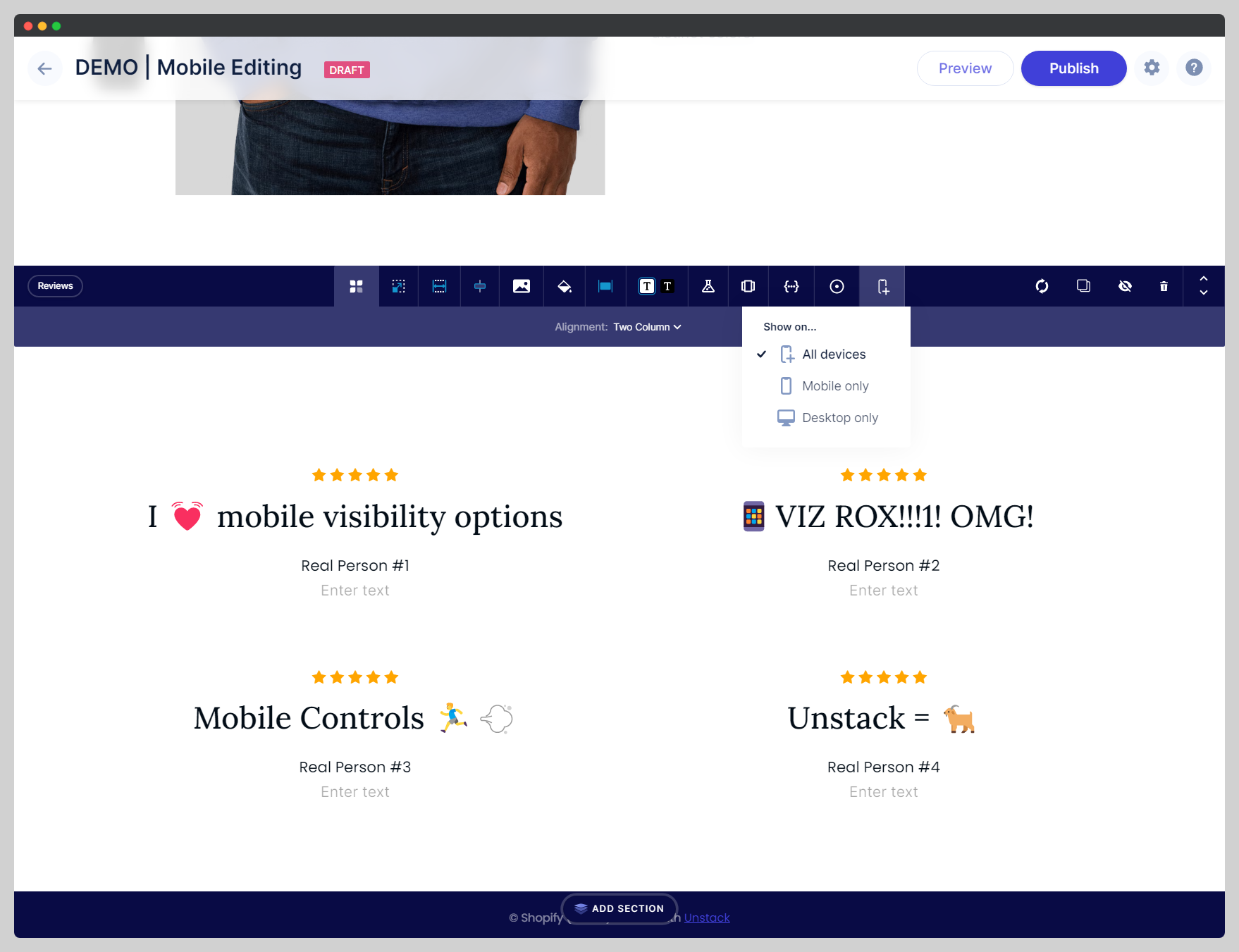
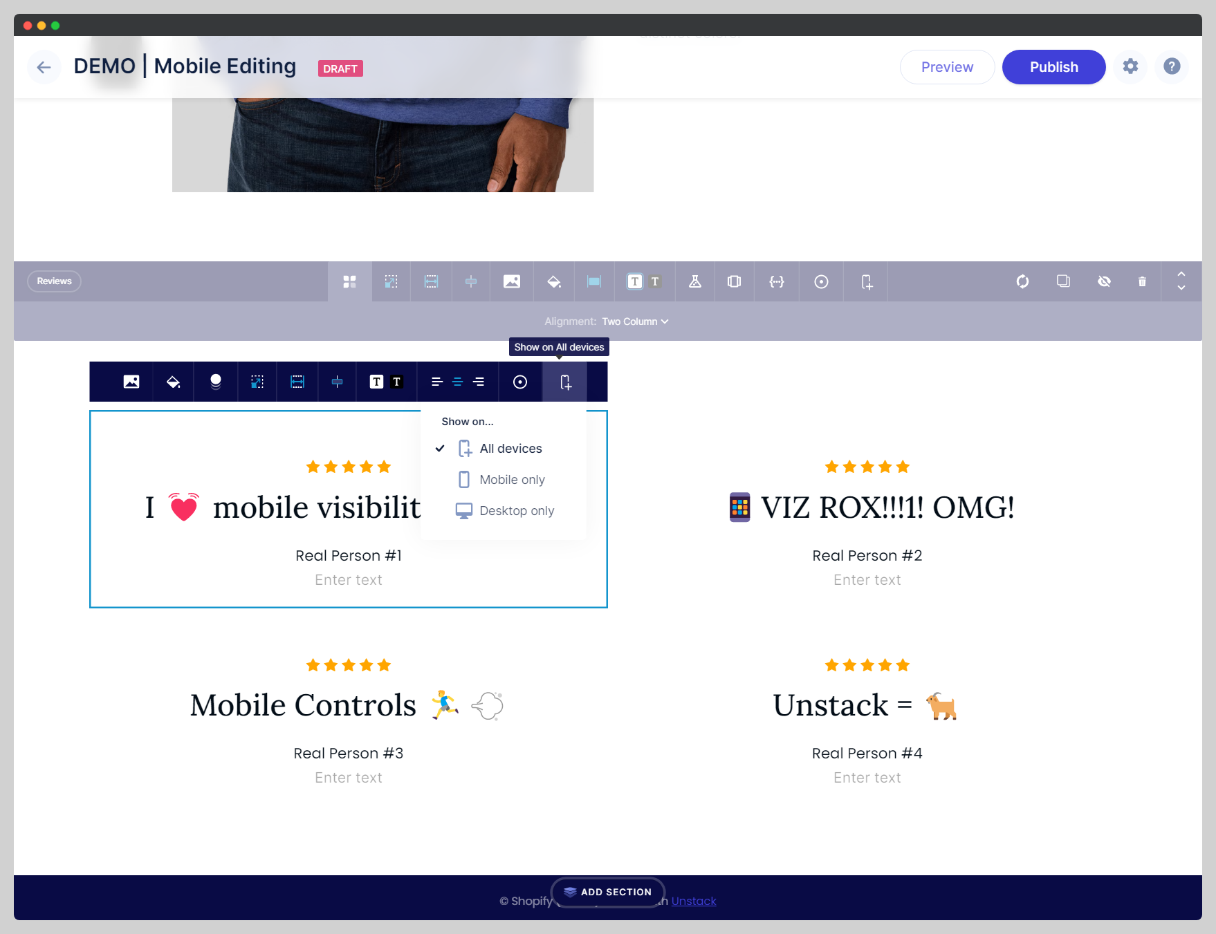
Therefore, if I were to set the below block to "Mobile Only" then it won't render on the desktop version of the site but will render on the mobile version and this is exactly what we see happening when looking at the rendered site!
