Product Collection
This generator is only available on eCommerce plans.
The Product Collection generator allows you to access elements of your product categories/hierarchies in your storefront. The Product Collection generator supports pagination.
<ProductCollection dataRef={content.products} tagName="div" .../>
Attributes
- dataRef: DataLocator - the data-element storing the Collection's configuration.
- item: anonymous arrow function - used to create a collection item.
- tagName: string (optional) - a hard-coded tag name for the rendered element.
- className: string (optional) - a hard-coded class name to add to the rendered element.
- minItems: number (optional) - the minimum number of items allowed in this collection (Default: 1).
- maxItems: number (optional) - the maximum number of items allowed in this collection (Default: 10).
- defaultItems: number (optional) - the starting number of items in this collection on creation.
- enablePinning (optional) - when
true, allows collections to be pinned. - enableSorting: boolean (optional) - when
true, allows content authors to drag-and-drop resort items in this collection. - enableFiltering: boolean (optional) - when
true, enables product collections to be included in filters.
Pagination
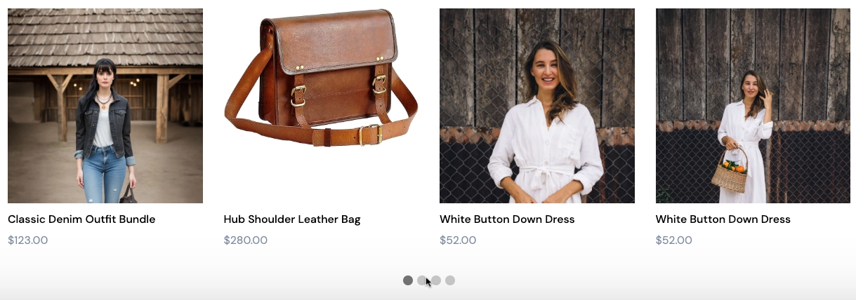
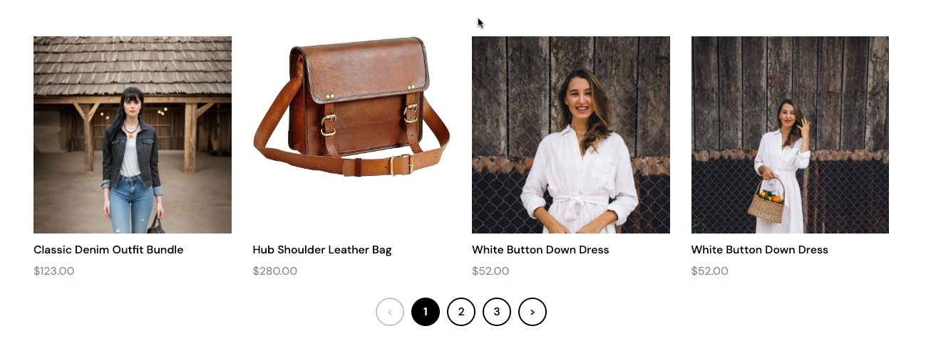
The collection generator supports pagination. If your product collection contains many products, your product collection can take time to load. Using pagination, you can extend your collection generator to show a paginated list of items. You can choose from the following indicator types:
-
dots

-
arrows

-
page numbers

The following table describe the pagination attributes.
| Attribute | Type | Required | Description |
|---|---|---|---|
enablePagination | boolean | Required | Set to true to enable pagination. |
defaultPaginationStyle | enum | Required | Depending on the indicator type you want, you can select either dots, arrows or numbers. |
defaultPaginationTransition | enum | Required | Depending on the transition type you want, you can select either slide, appear, or none. |
defaultItemsPerPage | integer | Required | Represents the default number of products per page for a category attached to a section. |
maxItems | integer | Required | Represents the maximum number of products per page that a user cannot go above. |
minItems | integer | Required | Represents the minimum number of products per page that a user cannot go below. |
defaultItems | integer | Required | Represents the upper limit of the total number of products in all pages. |
An example is shown below.
<ProductCollection
  dataRef={content.quotes}
  tagName="div"
  className="quotes"

  maxItems={9}
  enablePagination={true}
  defaultPaginationStyle="dots"
  defaultItems={1}

  item={(quote, i) => (
   <Item tagName="div" className="quote">
   <blockquote>
     <PlainText dataRef={quote.text} tagName="p" className="quote-text" placeholder="Quote" />
     <cite>
       <Media dataRef={quote.profile} category="image" className="profile" aspectRatio="1" />
       <div class="info">
         <PlainText dataRef={quote.source} tagName="h4" className="source" placeholder="Source name" />
         <PlainText dataRef={quote.position} tagName="p" lassName="position" placeholder="Add a description" />
       </div>
     </cite>
     <Actions dataRef={quote.actions} />
   </blockquote>
  </Item>
 )}
/>
Once you have enabled pagination for your product collection component, you can configure how pagination displays when you add a collection component to page. See Configuring Pagination for Product Collections.